Decentro | New York, USA
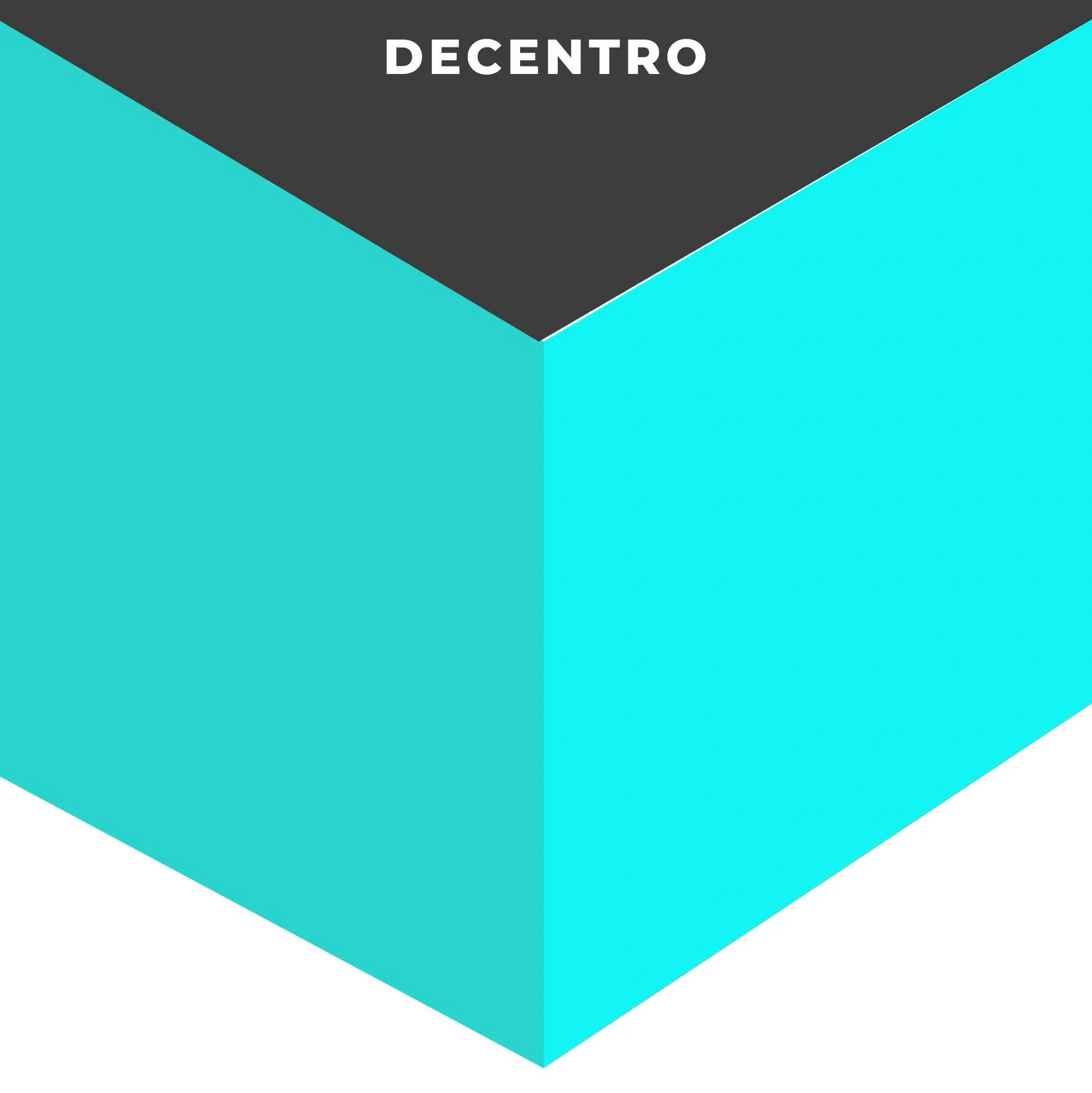
Decentro
Full Squarespace Website, Complete Identity & Bespoke Illustrations Case Study
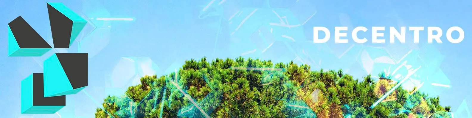
Learn how we helped Decentro bring their vision of “nature meets technology” to life by delivering a full Squarespace website, complete brand identity, and bespoke illustrations designed to create an immersive digital experience grounded in storytelling and motion.

Nature-to-tech transitions
Immersive scroll journey
Light-to-dark palette shift
Subtle interactive motion
Project Overview
The Client
Decentro is a forward-thinking fintech solutions provider offering API-powered integrations designed to simplify financial infrastructure for modern businesses. Their platform makes complex systems accessible through elegant technology, and their new website needed to mirror this ethos with clarity, innovation, and a deeply visual identity.
The Challenge
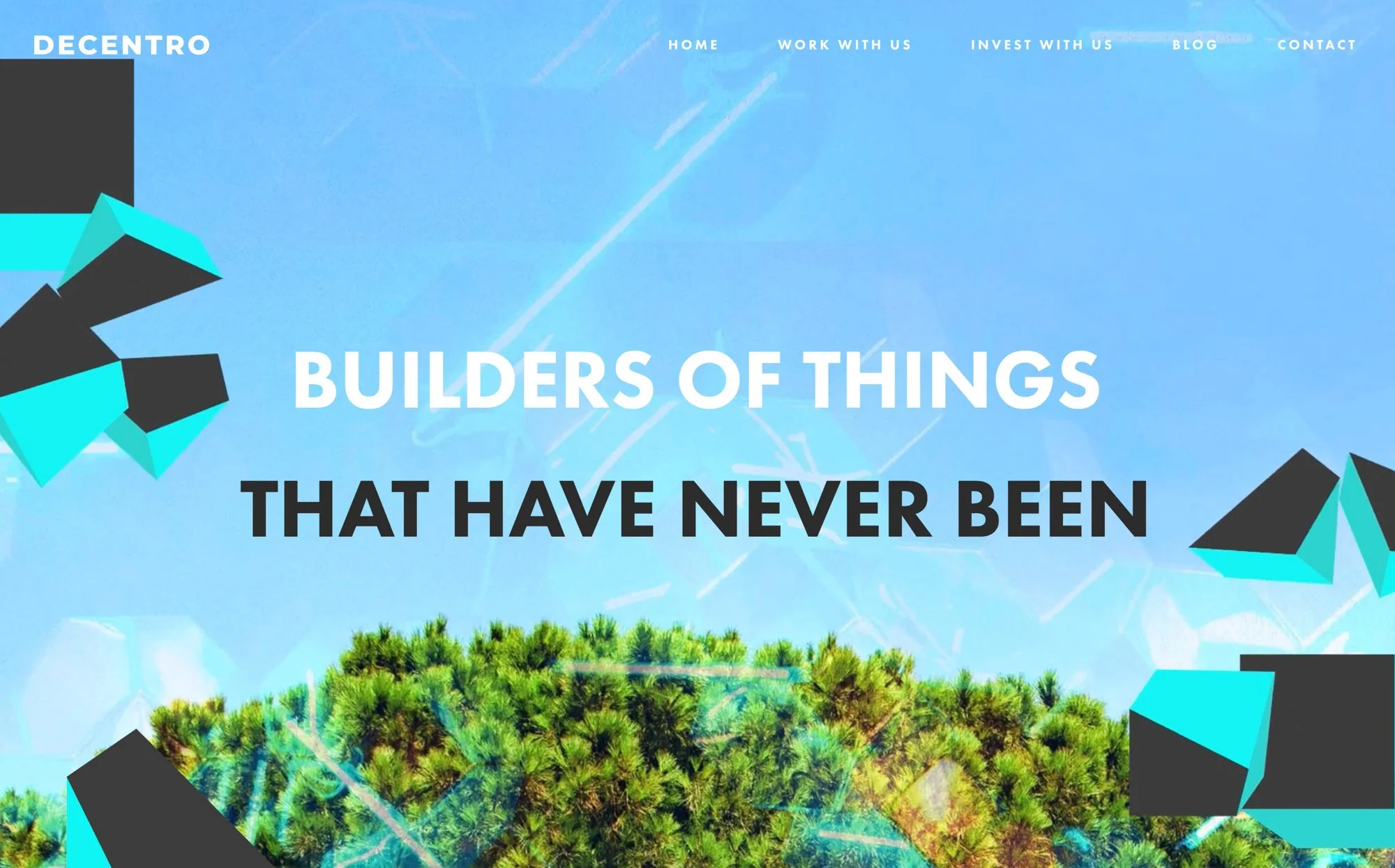
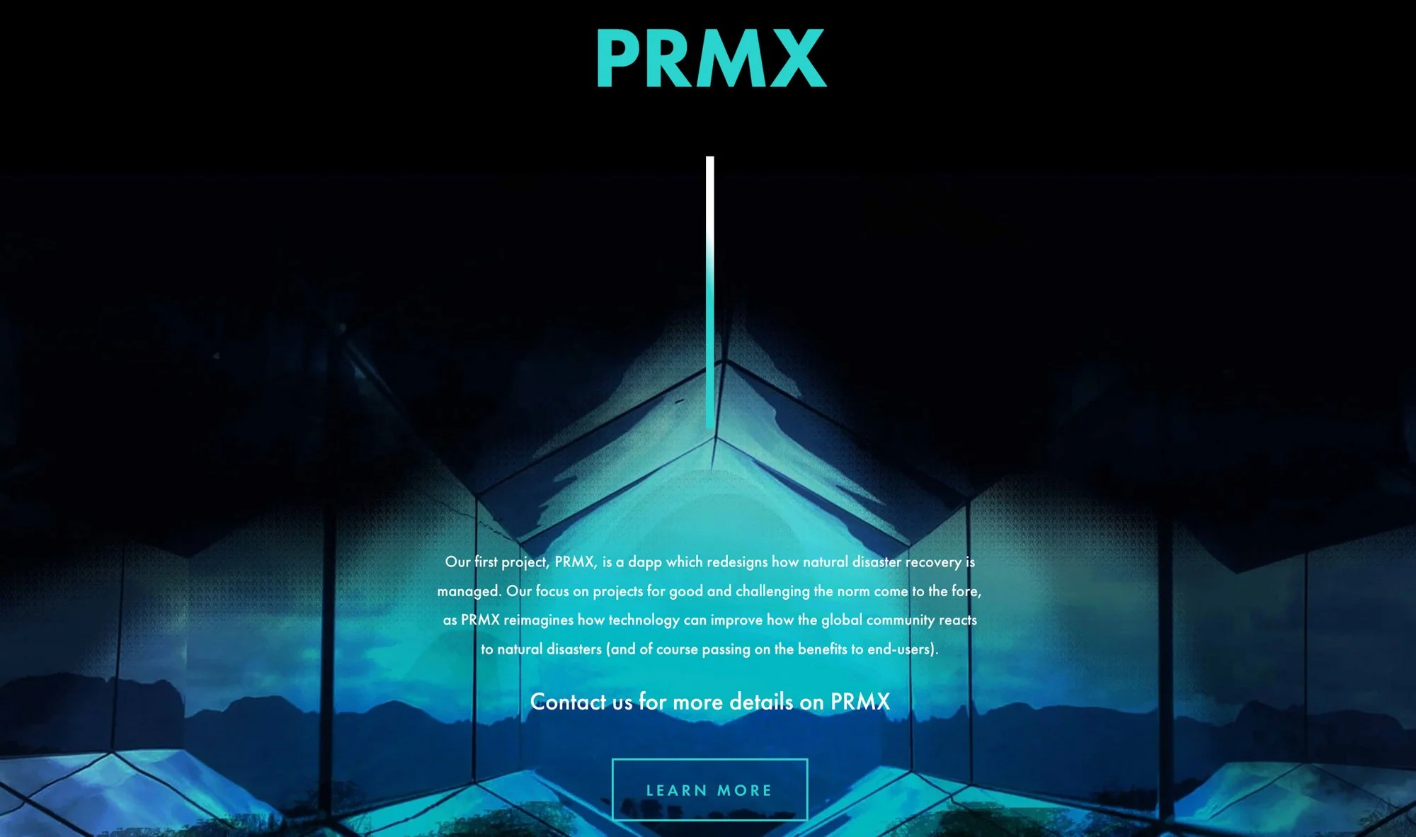
The client envisioned a concept where nature and technology seamlessly blend, with visuals that evolve from bright, organic elements into darker, more technical roots. They needed a continuously transitioning homepage background, custom animations, and a colour palette that shifts from light to dark as users scroll. Across the site, they required motion graphics, subtle interactive animations, and bespoke illustrations to express their unique narrative.
Our Approach
Visuable Packages
To bring this imaginative and technically nuanced concept to life, we delivered:
What We Delivered
Complete Brand Identity: A fresh identity blending organic and technological motifs to reflect Decentro’s vision.
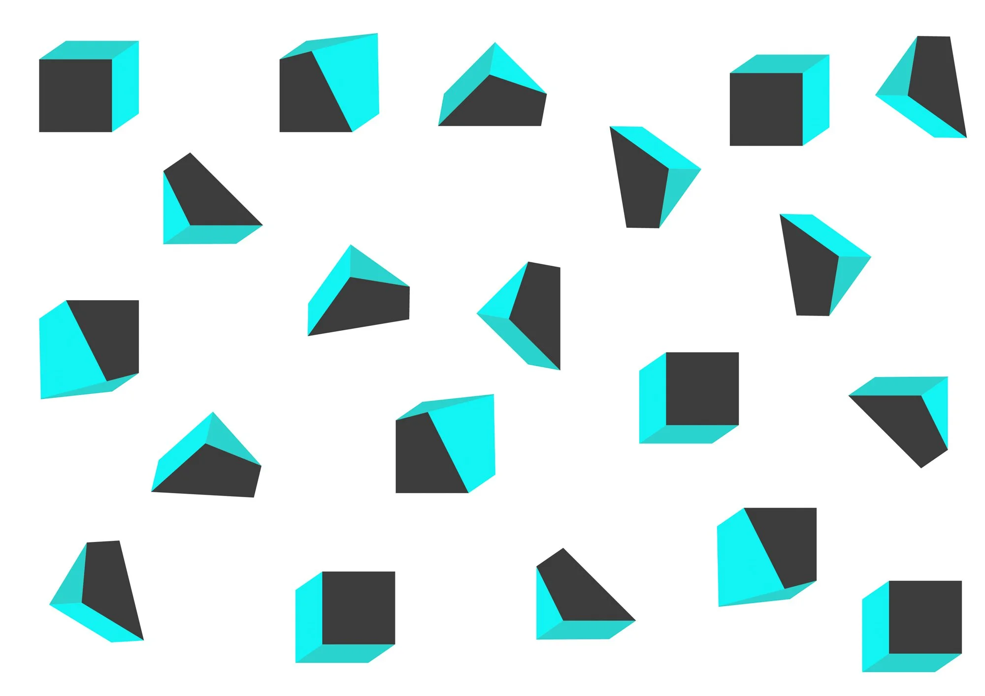
Bespoke Illustrations: Custom nature-inspired graphics fused with geometric tech elements to support the site’s visual storytelling.
Dynamic Homepage Design: A continuous nature-to-technology background with subtle transitions that guide the user journey.
Motion-Driven Experience: Engaging hero animation followed by gentle interactive movements to maintain interest without distraction.
Light-to-Dark Colour System: A sliding colour scheme that transitions from bright, natural hues into deeper, technical shades as users scroll.
Interactive UX Enhancements: Hover effects, micro-animations, and responsive behaviours that enhance usability and bring the design system to life.
The Results
UX & UI Design Outcomes
Immersive nature-to-tech visual flow: Created a standout first impression that communicates the brand narrative instantly.
Enhanced user engagement: On-page motion encouraged visitors to explore deeper sections of the site.
Improved navigation clarity: Complex information was structured into intuitive, easily digestible sections.
Consistent branded story across pages: A cohesive system of interactions, colours, and illustrations unified the entire user experience.
Creative Execution

Impact and Creativity
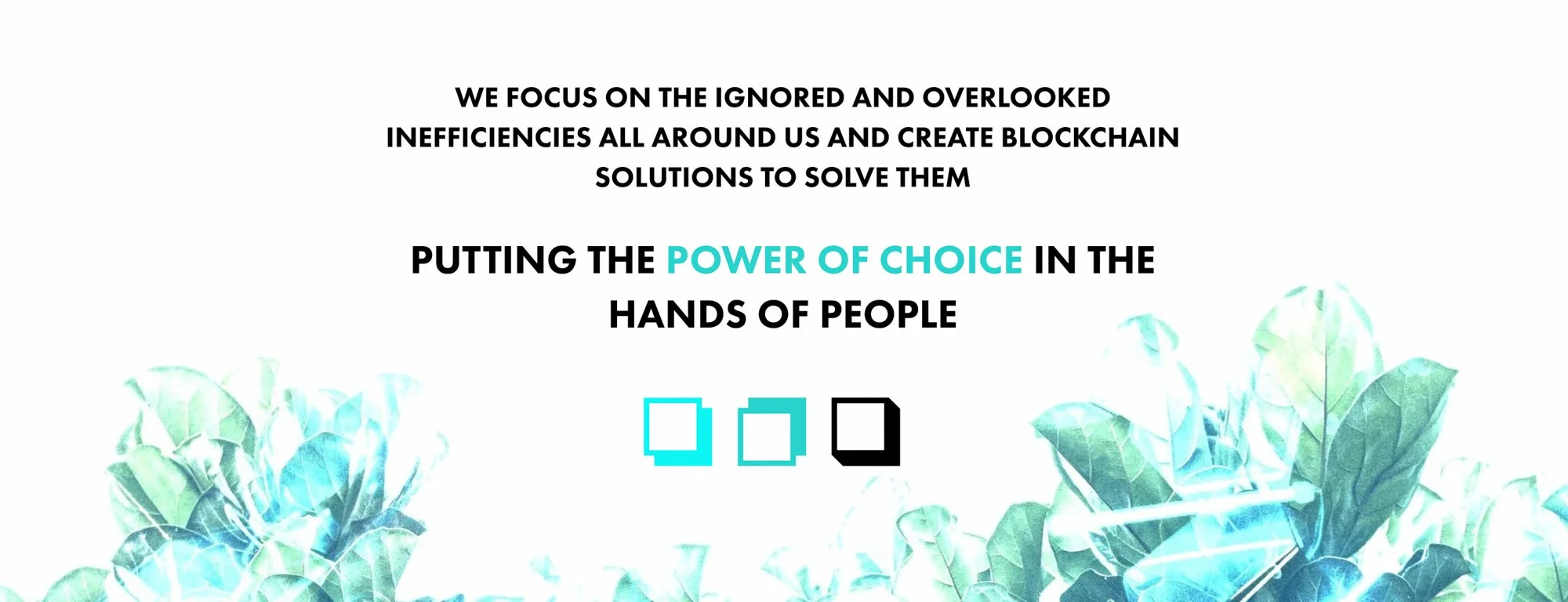
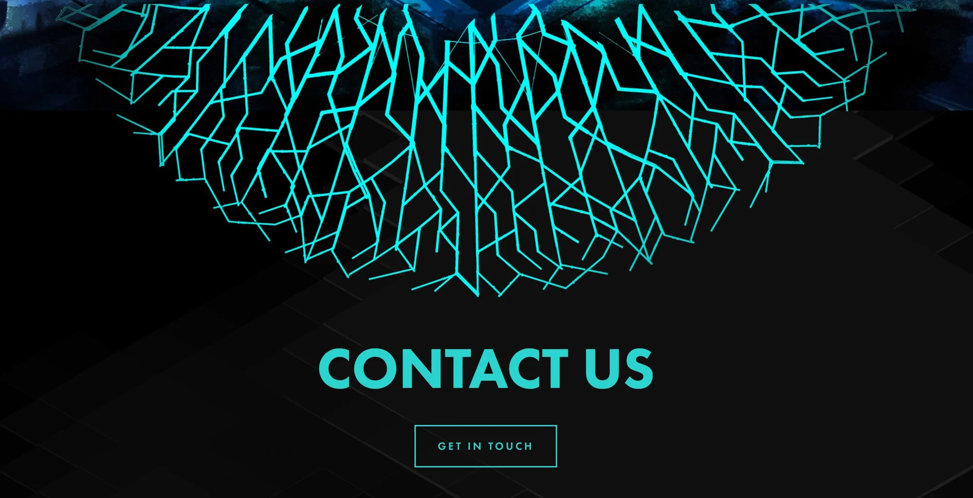
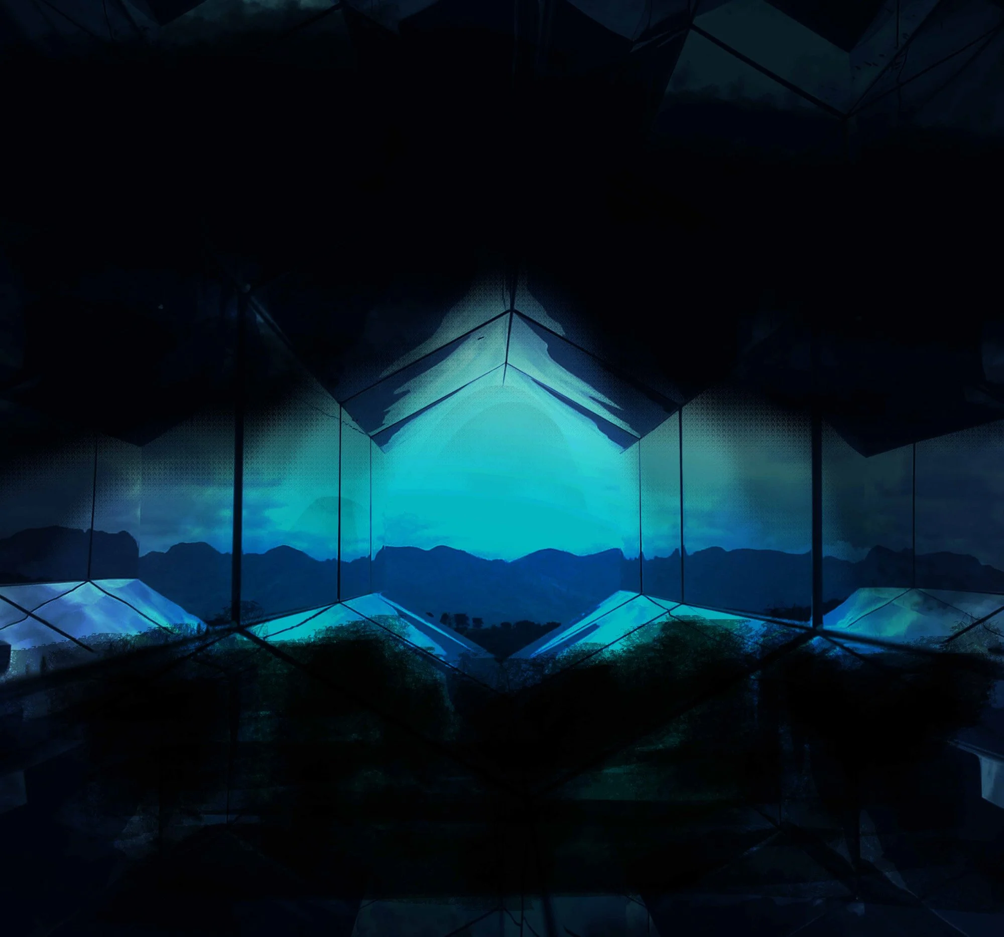
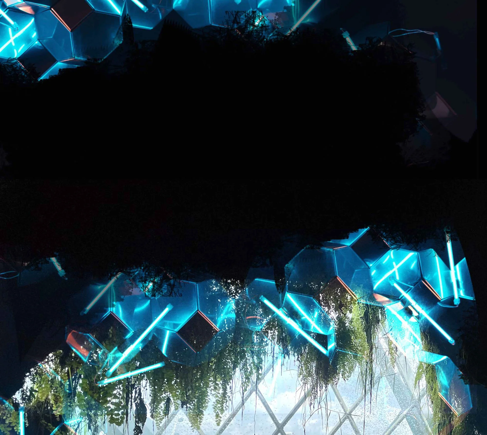
The design delivers a compelling first impression through a full-screen hero section where a soft, atmospheric forest scene is overlaid with floating geometric blocks that subtly animate into place. This establishes the contrast between nature and technology from the very first moment. As users begin to scroll, the natural background gradually transitions into a more abstract visual space, where organic shapes dissolve and angular tech-inspired motifs take over. This transformation is not abrupt; the blend is achieved through layered transparency, gradient overlays, and gentle motion that creates a seamless shift in tone. The interplay between light natural hues at the top and deep, moody gradients toward the bottom amplifies the sense of descending into the “roots” of technology. Every illustration—branches, roots, block clusters, and linework—has been crafted to feel simultaneously organic and engineered, giving the site a distinctive visual signature.
Functionality and User Experience
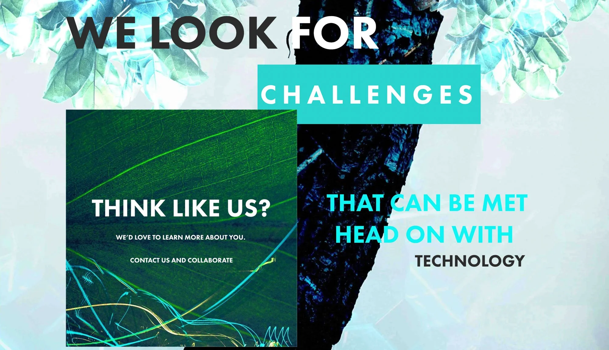
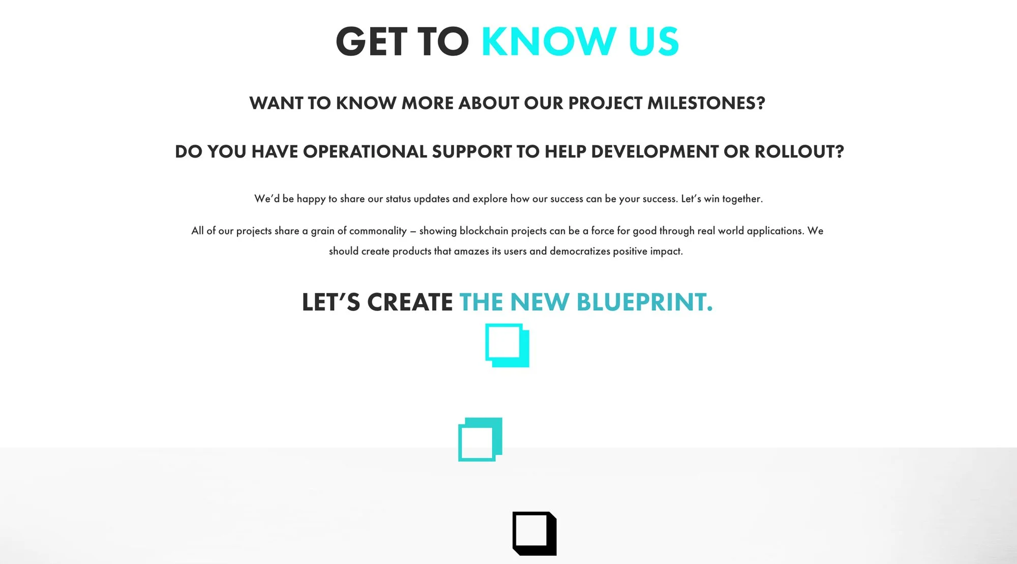
While visually expressive, the site maintains a clean and structured user journey. The hero animation is followed by a series of scroll-triggered content blocks that fade and slide into view at a measured pace, creating a sense of discovery without overwhelming the user. Cards rise slightly on hover, arrows extend with micro-movement, and icons shift in colour to give subtle feedback to interactions. The navigation remains minimal and consistent, allowing the user to stay anchored even as the visuals evolve. Section dividers use soft diagonal cuts and overlapping layers to replicate the feeling of shifting geological or root-like planes, guiding users smoothly from one concept to the next. Every content section is deliberately spaced, giving breathing room to complex topics and ensuring that users can absorb information at a comfortable pace.
Branding and Storytelling
The storytelling approach is rooted in transformation: nature becoming technology, simplicity becoming structure. This is reinforced through consistent visual metaphors—branch-like lines that start as organic curves and end as angular data pathways, tree roots that dissolve into network grids, and leaves reimagined as modular geometric forms. Typography remains modern and understated throughout, letting the illustrations and transitions carry the expressive weight. The sliding colour system gradually pulls users into a more technical visual environment as they scroll, mirroring how Decentro’s solutions simplify complexity the deeper one goes. Even internal pages, while quieter, carry echoes of the storytelling through motion accents, corner blocks, subtle glowing gradients, and the recurring natural–tech hybrid motifs.


Execution and Design Excellence
The precision of execution is evident in the smoothness of every interaction. Animations trigger at precisely controlled thresholds to avoid jarring jumps or over-triggering. Image assets and motion layers have been optimised to preserve performance despite the density of visual detail. The continuous nature-to-technology background on the homepage required careful alignment of gradient transitions, opacity masks, and overlapping illustration layers so the experience feels fluid rather than stitched together. Micro-animations—such as background particles drifting, blocks assembling, or icons responding to hovers—are subtle enough to maintain focus on content while still bringing the interface to life. Across devices, the design adapts intelligently: animations scale down gracefully, spacing adjusts to preserve readability, and layered visuals reflow to maintain clarity. The final result is a website that looks effortlessly cinematic while functioning with the precision expected of a modern digital platform.
Summary
Decentro’s website now stands as a powerful showcase of their innovative vision—merging nature and technology through thoughtful branding, purposeful design, and immersive on-scroll experiences. The combination of a continuous transforming background, interactive elements, and bespoke illustrations creates a visual story that feels both intuitive and distinctive. This project exemplifies how strong creative direction, strategic identity design, and polished execution can elevate a digital brand and leave a lasting impression.


Brand photography courtesy of Decentro
Consult with our Experts
Amazing brands start with an understanding of your goals and vision.
Our team understands the challenges of launching a brand online, and we’re here to answer all your questions and simplify the process for you. Let’s go!
Our Success Stories
Get inspired by real stories of how our designs have made a difference for brands like yours.


